Redesigning Pardonned with Claude Design and Claude Code
Background
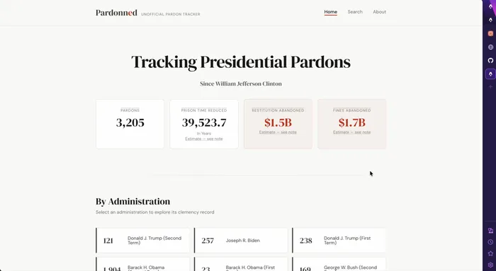
A few weeks ago, I launched Pardonned. Here’s the how and why of the project exists.
The initial design for it came from Google Stitch, where I told it that I needed help designing a site that would present the data I had already modeled. It came up with a pretty good design, and more specifically a DESIGN.md file that I could give to a programmer, or in this case an agent, to build out the rest of the site.
It did a decent job, but I had a nagging feeling that the design could be better.
Claude Design - My personal designer?
This weekend, I decided to try out Claude Design to see if it could help me redesign the site.
Ask The Designer - “can you make it better”
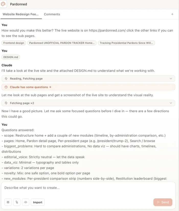
How would you make this better? The live website is on https://pardonned.com/ click the other links if you can to see the sub pages.
I told it to use the frontend-design skill, and I attached the initial DESIGN.md file from Google Stitch to give it a sense of the original design constraints.
It thought a little and came back to ask me if I wanted a bold or safe redesign, and if I was ok with a ProPublica type editorial style. I said yes to both, and it came back with two variants of every page.
Sidebar
Google Stitch asked me a similar question, specifically if I wanted the site to look like ProPublica. At that time I had said no.
Claude Design is very impressive (to me). It gave me two mockups of each page, and allowed me to tweak individual elements with just comments. I’ve always struggled with tools like Figma, I found this to be easy to use and iterate with. When I was happy with the mockups, I asked it to give me something I hand off to a developer so they could implement the changes. It gave me a set of HTML files, JS, and CSS along with a README that explained how to use them.
Handoff to Claude Code
I told Claude to use Matt Pocock’s Grill-me and to-issues skills to break the implementation down into small testable chunks. It came back with a set of issues in GitHub, each with a clear description and acceptance criteria. I was able to review each issue, ask follow-up questions, and then approve them one at a time.
You can see the issues here
My Conclusions
Claude Design is really cool, I plan on using it more
Layout, color schemes, and presentation have never been my strong suit, I find design language intimidating, when I saw people clicking layers and lasso tools in Photoshop, and then lately when I saw Figma designs, I was always amazed at how other people took that design and understood what the designers meant. With Claude Design, I can see a full functional mockup, and I can read the reasoning behind it, which makes much more sense to me.
I’m probably going to use Claude Design to redesign this website, and probably some other projects. If and when I think of a new project, I’ll start with Claude Design and see how that works out.
Compare The Redesign To The Original
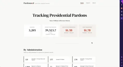
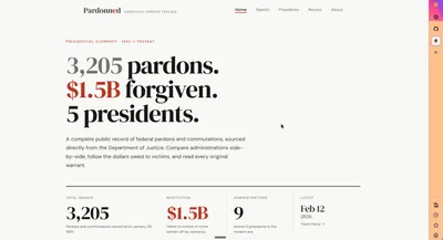
Old on the left, new on the right. The homepage led with stat cards and a generic title; the new one leads with the data itself.
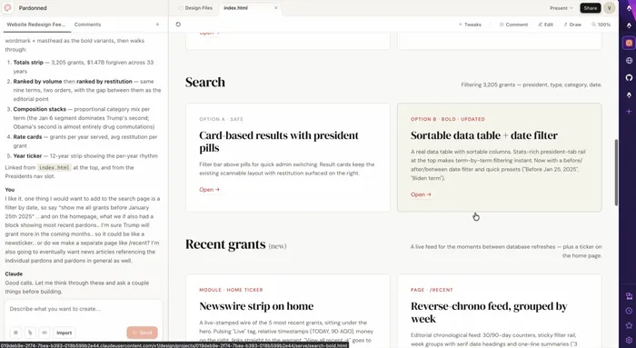
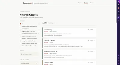
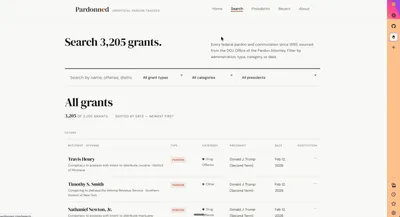
The search page moved from a left-side filter rail with stacked result cards to a proper sortable data table with a top-aligned filter bar and a date filter.
New Pages that Claude Design Recommended
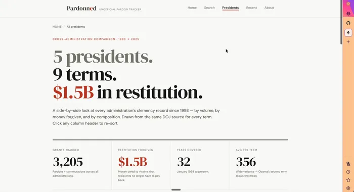
The cross-administration comparison page didn’t exist in the original — it came out of the design conversation. Five presidents, nine terms, $1.5B in restitution, all sortable.
Claude Design also proposed a /recent page and a Newswire strip on the homepage to surface the most recent grants between database refreshes — both of which made it into the final implementation.
The redesign is live at pardonned.com. The repo, including every issue and PR, is on GitHub.